Redesign + Visual System
USC Manager Gateway
Art Direction, Design, & Illustrations: Kandace Selnick
Creative Director: Candice Lawson
Web Developer: Cheryl Xu
Team: USC Human Resources, Equal Opportunity, and Compliance Strategic Communications
A comprehensive refresh of USC’s Manager Gateway was undertaken to elevate the manager experience and transform the platform into a modern, resource-rich tool.
The goal: to provide USC managers with a cohesive, user-friendly interface that supports confidence, clarity, and informed decision-making.
The site leverages illustrative elements to clearly signal support and accessibility — key themes aligned with the site’s purpose. This visual approach contributed to a broader identity designed to convey optimism, aspiration, and progress, reinforcing the site’s role as a trusted resource for university managers.
Further improvements include:
Overhauled 45+ pages across copy, UX, and design, collaborating with 4 partner teams and 9 subject matter expert groups.
An improved site map and streamlined wayfinding to help visitors quickly find what they need.
A refined user experience designed for ease of use and efficient access to information, elevating the overall manager experience.

Creative Direction
The creative direction places illustrative elements prominently across the homepage and landing page banners, visually reinforcing themes of support and accessible resources.
Landing Pages
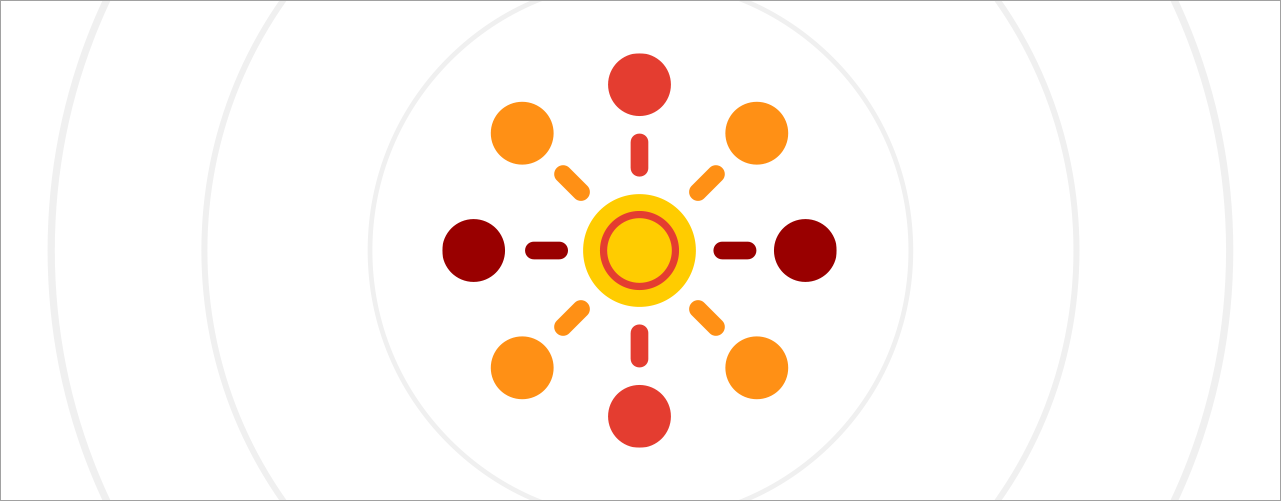
Hiring & Compensation: Focused on building and attracting talent, with inward circles symbolizing a welcoming process.
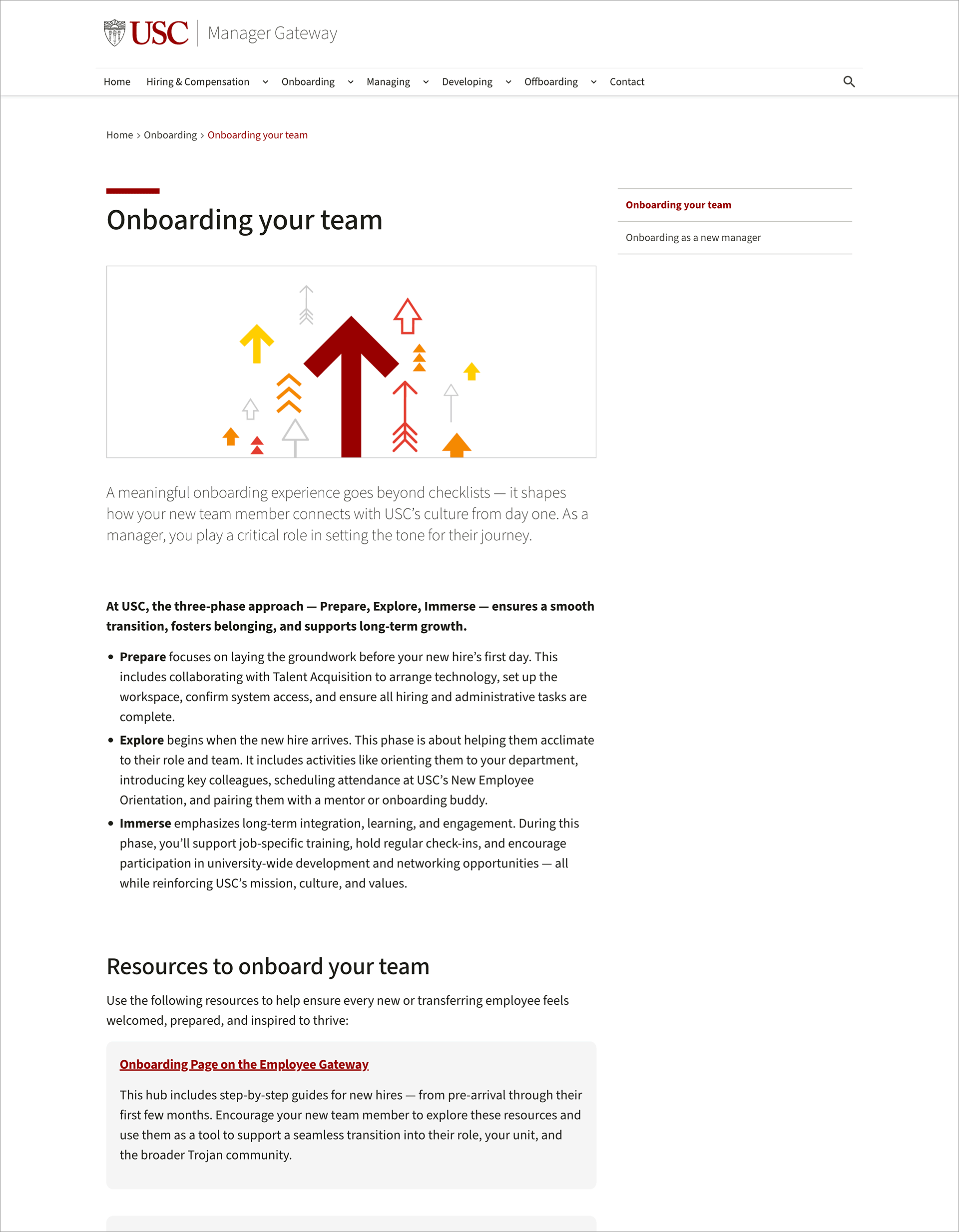
Onboarding: Represents smooth transitions and support, with visuals of guidance and growth.
Managing: Reflects balance, collaboration, and steady support.
Developing: Centers on growth, mentorship, and talent investment.
Offboarding: Emphasizes transitions, with outward arrows signaling closure and departure.


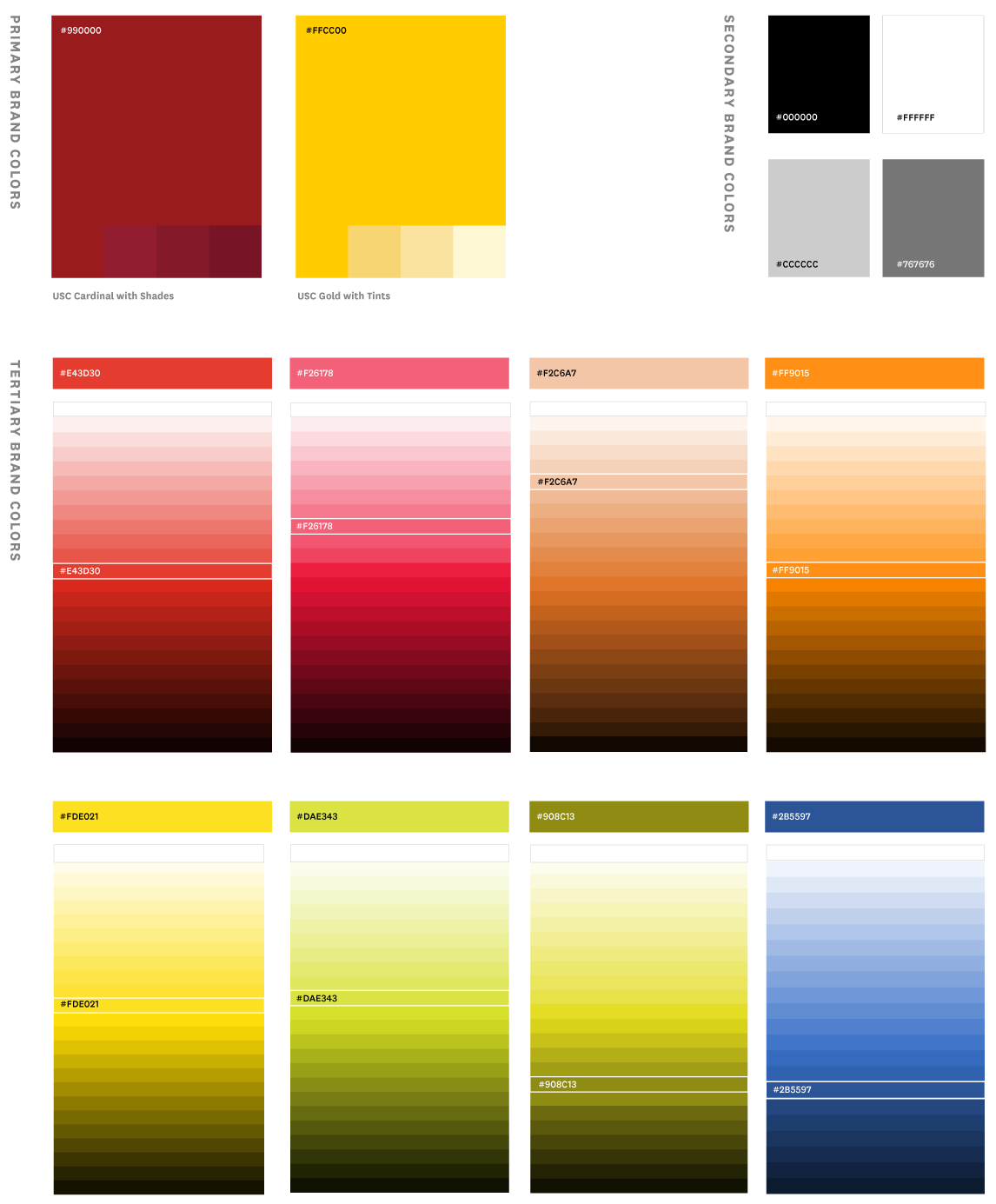
Extended Color Palette
As an internal resource designed for university managers, the site required a visual identity that felt both familiar and distinct.
To achieve this, the color system expanded on USC’s tertiary palette by introducing a range of tints and shades. These expanded colors were used to create gradients, preserving brand integrity while bringing warmth, positivity, and an inviting tone to the experience.
The gradients applied to the homepage and landing pages added a sense of lightness and openness, while consistent iconography, using the core brand tertiary colors, reinforced brand cohesion and familiarity across the experience. Together, these elements established a visual language grounded in optimism, aspiration, and progress.
Color Exploration by Austin Montelius
Art Direction by Kandace Selnick
Icons & llustrations
To enhance clarity and engagement across the site, a series of abstract icons and illustrations were developed to represent complex HR and management topics. Designed as a unified system, the graphics provided consistency while reinforcing USC through the use of analogous colors drawn from the core brand tertiary palette.
These visual elements were thoughtfully integrated throughout the site to help conceptualize technical content, making it more accessible, relatable, and easier to navigate for university managers and internal users.